
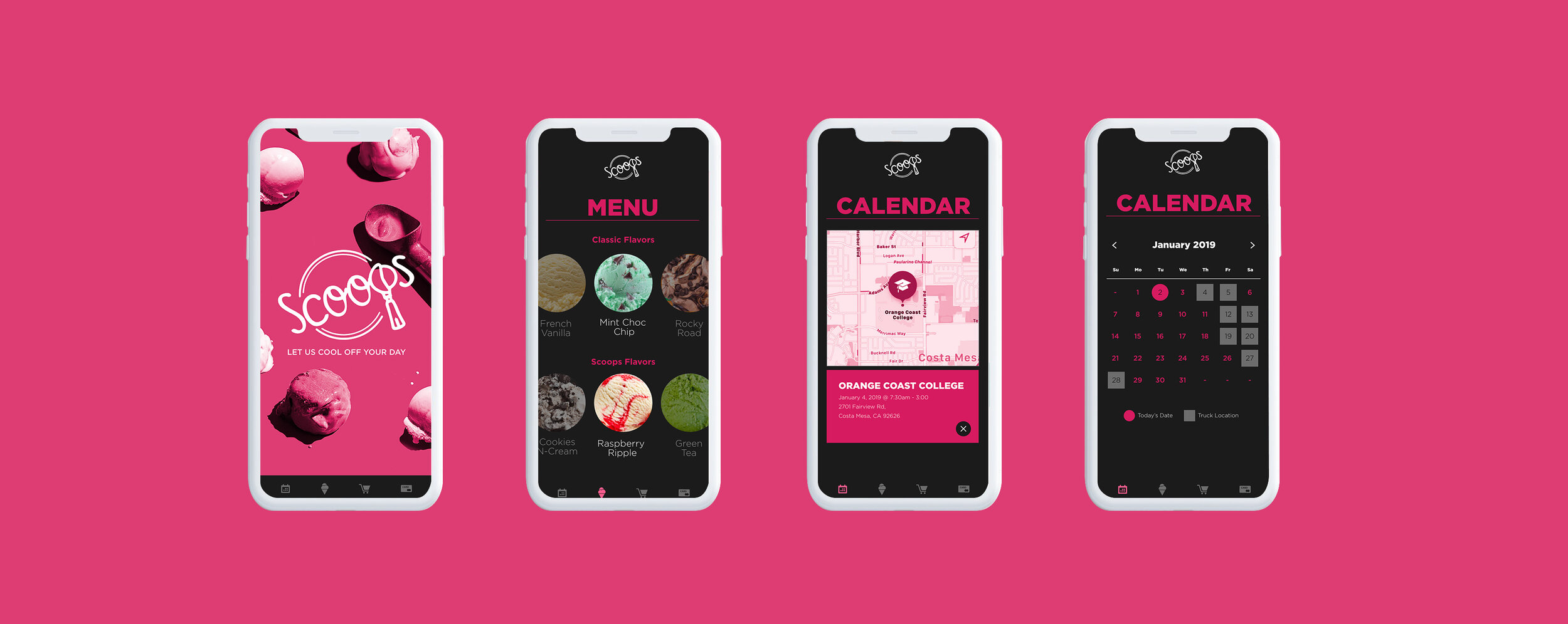
Cart girl application
Client: Self Created
Problem / task: I created this App to solve the everyday Friday night issue when trying to entertain a group of guests. When playing music through a sound system or external speaker and somebody wants to share their song with you, you have to stop what you are currently playing and sync them in. Annoying!!!
Process: With QueuesNext App you can have your own personal music queue to share with your friends and they can load any mix or song in the queue that you created. I created intern report to be both student and agency focused. There are four categories that students can be in: Art direction, graphic design, copywriting and strategy. I really wanted to focus on advertising and capture the audience of creative students. For my branding I created a simple type oriented logo. The font I used was Calluna Bold and for the body copy I used Avenir. I really enjoy the way these fonts pair together and I think it works well in the app. For colors I wanted to keep it very clean and simple. I used mostly black, white and coral. I wanted to create an app that was easy to navigate and fun to use.
Role: UX Design, UI Design
Deliverables: Logo | App Design

simply dummy text of the printing and typesetting industry. Lorem Ipsum has been the industry's standard dummy text ever since the 1500s, when an unknown printer took a galley of type and scrambled it to make a type
simply dummy text of the printing and typesetting industry. Lorem Ipsum has been the industry's standard dummy text ever since the 1500s, when an unknown printer took a galley of type and scrambled it to make a type

e and don’t focus on the agency side. I created intern report to be both student and agency focused. There are four categories that students can be in: Art direction, graphic design, copywriting and strategy. I really wanted to focus on advertising and capture the audience of creative students. For my branding I created a simple type oriented logo. The font I used was Calluna Bold and for the body copy I used Avenir. I really enjoy the way these fonts pair together and I think it works well in the app. For colors I wanted to keep it very clean and simple. I used mostly black, white and coral.

e and don’t focus on the agency side. I created intern report to be both student and agency focused. There are four categories that students can be in: Art direction, graphic design, copywriting and strategy. I really wanted to focus on advertising and capture the audience of creative students. For my branding I created a simple type oriented logo. The font I used was Calluna Bold and for the body copy I used Avenir. I really enjoy the way these fonts pair together and I think it works well in the app. For colors I wanted to keep it very clean and simple. I used mostly black, white and coral.
Mind Mapping
